The Making of ISS: Zenith
The International Space Station (ISS) is one of the greatest marvels of human engineering. We’re talking about an orbital platform so large it could be seen from earth with the naked eye. It’d taken sixteen countries over ten year, a couple hundred spacewalks, and more money than anyone without job security would admit to finally complete her. What would it take to build another one, if another one could ever be built? —Max Brooks
At Interactiva, we sought to do just that: develop a unique blend that combined gamification techniques, a storyline, and simulation elements all in one virtual International Space Station.
We used NASA’s existing ISS Spacewalk Game as a reference, a game developed in 2010 that features a series of levels where the user, an astronaut, needs to navigate the exterior environment around the space station following a series of tasks before they run out of oxygen. We found the zero-gravity physics entertaining to try and navigate with; however, there was no easy way of guiding the astronaut once they gained velocity–a failsafe against this was pressing the ‘Z’ key, which would completely halt the astronaut instantly. We knew we had to devise an intuitive way of handling Zenith’s zero-gravity physics without feeling out of place while being easy to use.
Beyond the nitpicks, Spacewalk’s game concept was great, but the underlying technology was outdated. The game used the Unity Web Player, which is now unsupported by modern web browsers. The only other way of accessing the game was via PC and Mac downloads that needed to be installed. We sought to develop ISS: Zenith using the modern WebGL standard and dedicated Mobile apps optimized for touch devices so that the experience would be completely cross-platform.
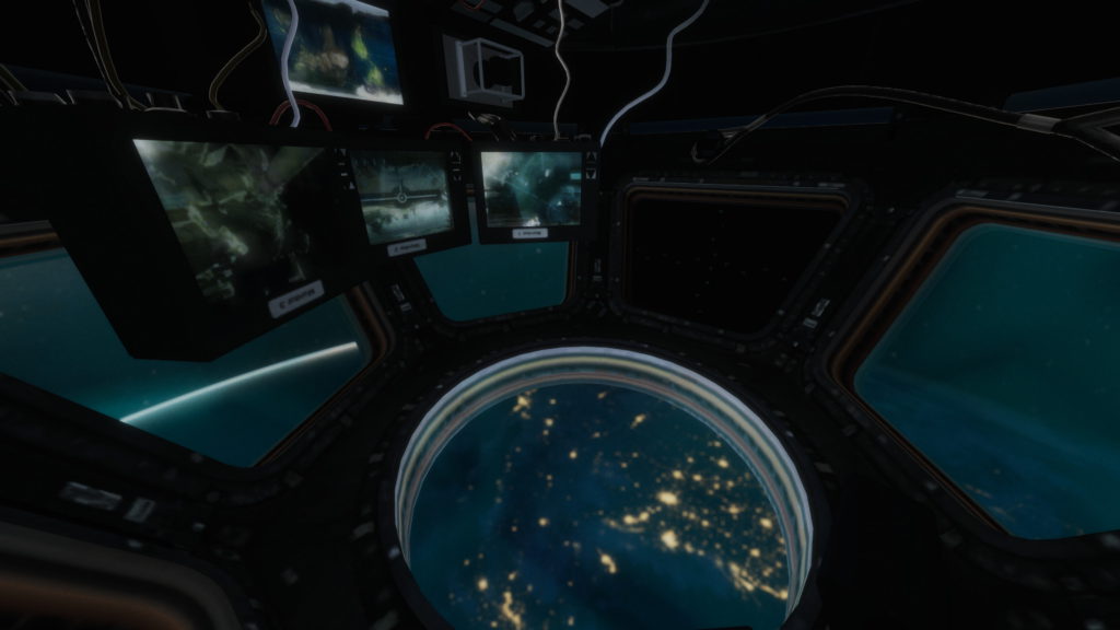
The visuals of the Spacewalk Game were starting to show their age. From the start, one of the first things an astronaut does in a spacewalk is to admire the view of Earth. This view only favored a somewhat blurry image of the Earth, so when we started the development of ISS Zenith, we knew that this had to be the critical visual highlight of the experience.
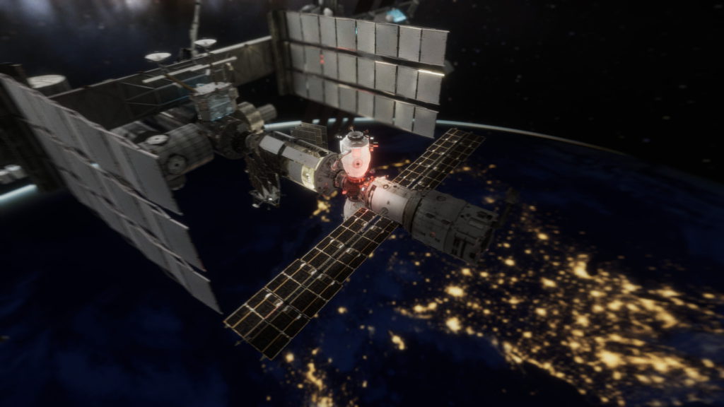
But we didn’t stop there. Another key area was the interior of the station. In the Space Walk game, the astronaut starts at the exterior airlock without being able to enter or interact with the systems and equipment inside the station. In ISS: Zenith, we wanted to let the user enter and exit the station whenever they pleased, regardless of the mission objective. Users could locate inside or outside depending on the specific task.
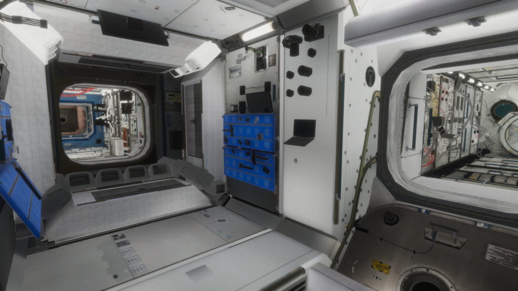
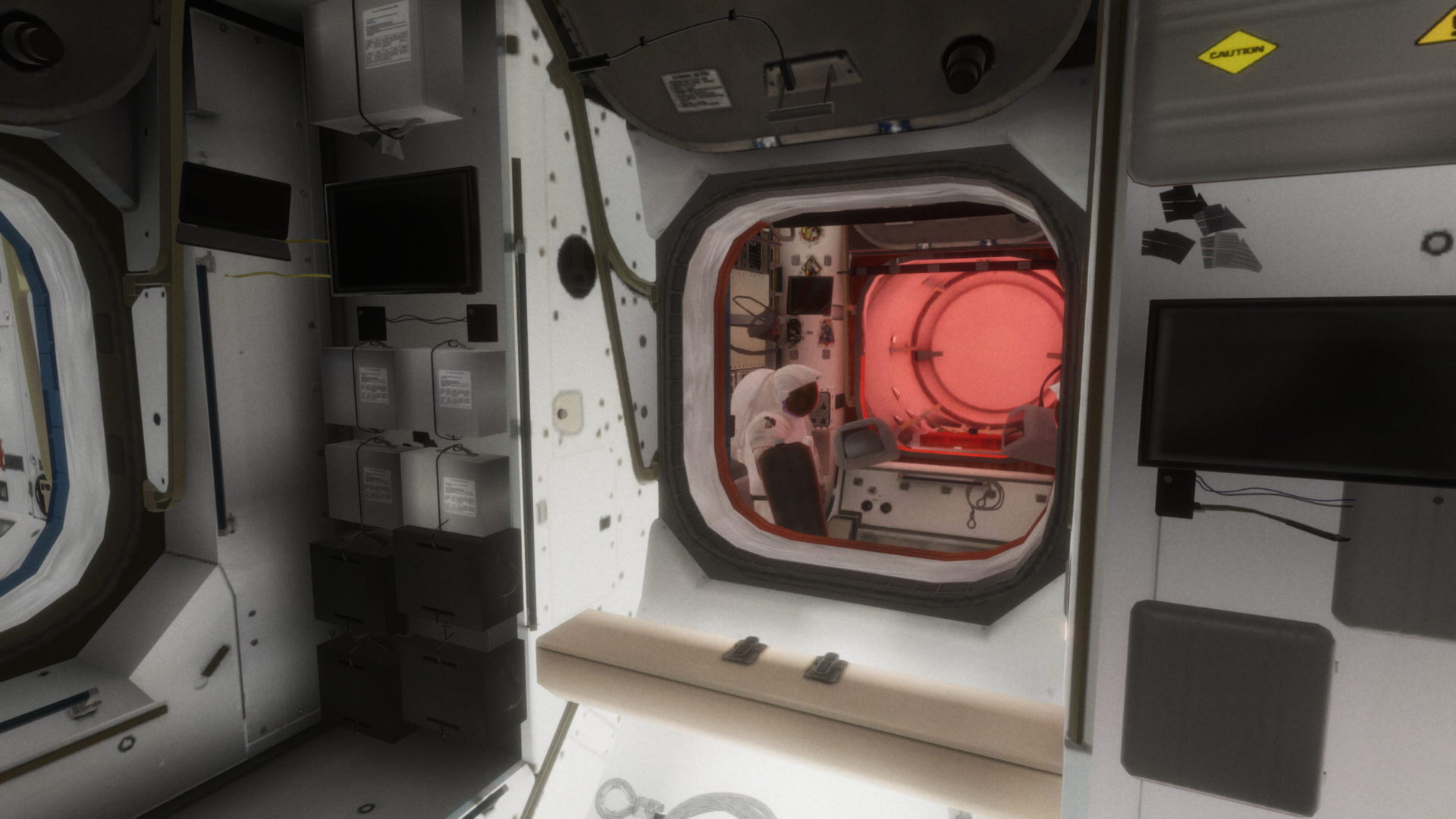
We upgraded the visuals to use the latest rendering techniques, like global illumination and post-processing effects, which give the station’s lighting that extra “oomph” without overpowering the white-colored theme of the frame. We put a lot of attention to detail in modeling all the instruments and equipment–creating the interior was one of the more challenging and fun tasks we’ve had at the studio. If you look closely, you can look at various instruments, from water purifiers to sleeping quarters, hidden compartments, and the famous Cupola; they’re all accessible.
The game was directly ported to Mobile using touch-optimized controls such as on-screen joysticks and buttons. We also added a Waypoint marker that would point towards the objective location; we found it easy to justify it with the precise zero gravity movement by baking them into the story. The Heads Up Display (HUD) is part of new experimental technology that the player is testing out.
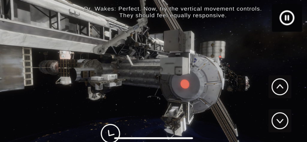
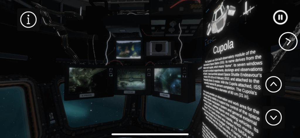
The Spacewalk game required users to cancel or finish the current mission, load the main menu, and select the next mission to continue. We wanted to give the user a seamless and cohesive experience, so we built an entire storyline with characters, voice actors, and simulation tasks centered around the main plot in one single playthrough with no loading screens.
The plot followed a basic three-act structure, separated into three days. Featuring six characters, a story that keeps you on your toes, and suspense that builds to a sequel, all while maintaining simulation elements (such as operating the remote-controlled Canadarm) that help the user learn about the station as they uncover the plot.
The first day sees the character first testing the new experimental technology while running a series of routine (and not so routine tasks) that are usually conducted on the station. As they continue to uncover the plot, there seem to be a few connection problems with mission control, illustrated by the voice-driven cutscenes in the simulation. However, we wouldn’t want to spoil the entire thing.
OMG what an amazing game, I played it ’till the end —Andrew Ngui, Director GPEDC
We were very proud of the launched product, our most downloaded app, reaching over 2000 downloads in just over two months, together with 4500 playthroughs. The simulation is free to play–we’d love to hear what you think! Try it out at www.interactiverse.app/ISS


